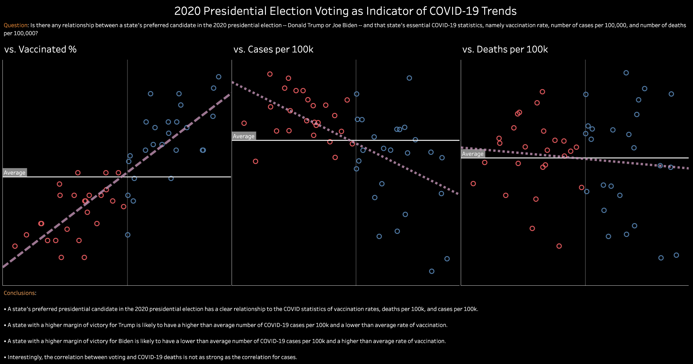
This is a simple visualization I created in Tableau using various public COVID-19 data. COVID-19 changed the world in the spring of 2020 and quickly evolved into not just a social and cultural issue, but a political one as well. In the months since the outbreak began, Americans have become polarized around auxiliary things like vaccinations, lockdowns, and masks. People who lean Republican generally appear to look upon the aforementioned COVID measures unfavorably, while Democratic-leaning people generally hold the opposite view.
It is reasonable to assume, based on the trends of supporters of both parties, that there might exist a relationship between a state’s preferred candidate in the 2020 presidential election – Donald Trump of the Republicans or Joe Biden of the Democrats – and that state’s COVID outcomes, specifically around cases, deaths, and vaccination rates. Rather than rest on an assumption, I analyzed public COVID data using Tableau to explore whether such relationships exist.
Highlights
- Downloaded and cleaned data in Excel
- Loaded data into Tableau
- Created dashboard in Tableau
Applications used
- Excel
- Tableau
Preview